Let me share some visualization sketches from early March 2020, that I used to communicate around me about the upcoming pandemic.
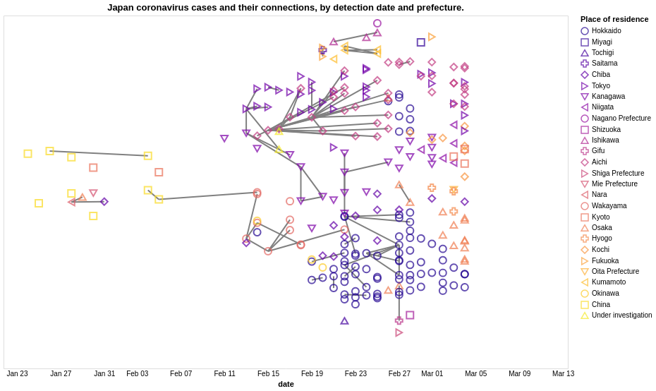
This first one depicted the individual cases detected in Japan and the known links between them. It shows that early on, systematic contact tracing could not be achieved and that given the situation in Wuhan, Japan was also facing a crisis if no action was taken to decrease mobility.
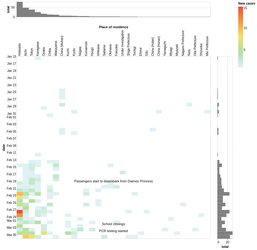
The next one shows the emerging exponential growth trend per prefecture, with 3 main risk area around Hokkaido, Tokyo and Nagoya.
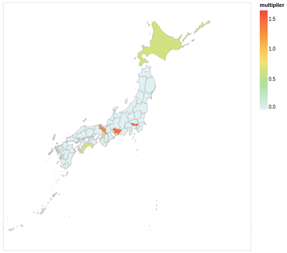
This map visualization also represents the growth rate per prefecture, to help identify any regional trend.
The code is available on github, with data from kaz-ogiwara/covid19